_logo.svg.png)
Grid Css Layout
Using CSS grid and flexbox to easily build navbars!
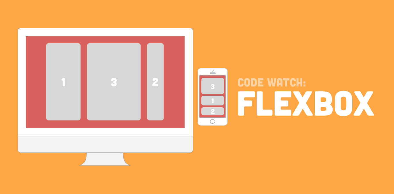
Flexbox Featured
This pen contains use of flexbox for the headline and feature section! We use it in our mobile navbar and show the power of mixing css grid and flexbox.
CSS Grid Navigation
While flexbox is used for the the mobile navbar, CSS grid is used for the desktop navbar showing many ways we can use both.

Basic HTML5
This pen contains basic html to setup the page to display the responsive navbar.This pen contains basic html to setup the page to display the responsive